

UI/UX Redesign Web Dashboard
At Hive, I worked with PMs, SWEs and Product Designers to redesign the UI/UX for of Hive’s flagship products (Hive Micro) to improve visual design and usability.
What is Hive Micro?
Hive Micro is a website where users complete tasks on/ label content (images, video, audio, text) and get paid.
How it works:
Users visit Hive Micro and find jobs with specified tasks e.g. select images with cars, transcribe audio clip into text
Users complete a job and the data is used to train Hive’s AI/ ML models to learn, identify and label similar data autonomously
Users are paid for their time and completing jobs!
Project introduction
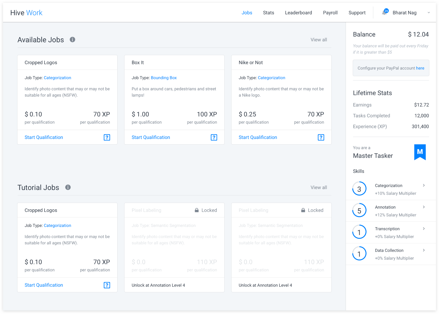
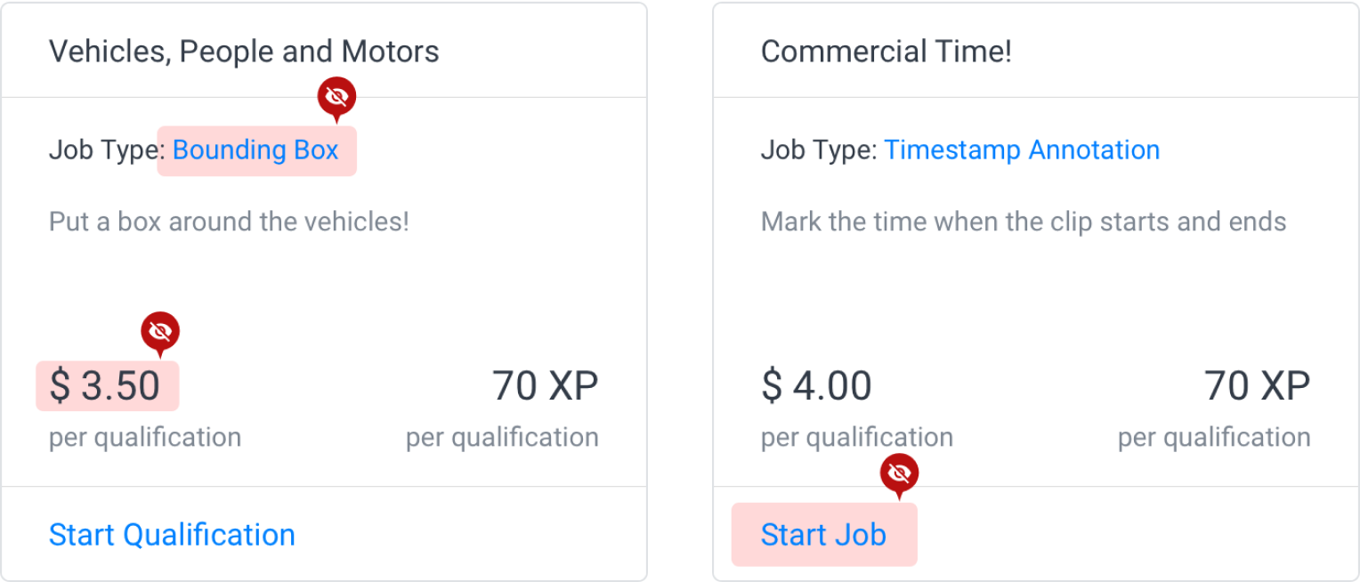
Hive Micro currently presents jobs to users in a standard grid layout with little organization and structure. My design team redesigned the interface of job listings to help users browse and find preferred items more easily.
My team
My role involved discovery, user research, wire-framing, hi-fidelity designs, prototyping, user testing, dev hand-off
In collaboration with 2 Product Designers, PM, SWE team
User research
My team and I conducted user research to learn how our existing customers used the website to search for and complete jobs. We conducted interviews and surveys to gain insights into current workflows, needs and pain points. We also considered the range of customers using our platform from new to seasoned users.
Original design findings
User goals:
High paying wages
Consistency of work/ job type
Jobs that don’t require a qualification test
Progress tracking
Pain points:
Job types hard to find
Qualification vs Job option is confusing
User personas
From user research, we were able to consolidate our user needs, goals and pain points into two main target user personas.

Seasoned user
✅ I try to prioritize high earnings when considering a job.
✅ I like to get better at the work I do to receive more rewards faster.
❌ I’m unable to easily browse jobs offered and find which ones I prefer.
❌ It’s frustrating to miss out on compensation when I’ve put time into a job.

New user
✅ I discover and work on jobs in my spare time.
✅ I’m more interested in jobs familiar with or what peaks my interest!
❌ I can’t remember what jobs I’ve tried before to do similar work.
❌ Micro-working sites are new, overwhelming/ hard for me to understand.
This lead to our main problem statement:
“How might we redesign the interface to help users find more relevant jobs and better engage in their work?”
Ideation
Here are some examples of ideations the team and I considered:

Final outcome
After ideating, the team concluded on this final design.
Items considered:
Colored “job type” tag, price font hierarchy, progress bar, sequential button
Price bolded to stand out above other details
Save, progress bar allows users to track jobs, invest more to completion
Qualify & Job start button show sequential process & visual indicator


Onboarding new users
We also ideated on how to rework the onboarding sequence. Inserting the onboarding into the dashboard interface allows the user to freely browse or start a tutorial on their own time. The direct 1:1 tutorial to real job design allows the user to better understand the various elements on our website.
